library(tidyverse) #load packages
library(janitor)
library(here)
library(readxl)
library(ggeffects)
library(showtext)
library(MuMIn) # model selection
library(DHARMa)
library(gtsummary)
library(rstatix)
font_add_google("Noto Serif Georgian") #download custom font into Rstudio
showtext_auto() #enables downloaded font
reading_data <- read.csv(here("data", "reading_data_final.csv")) #load reading data
kelp <- read.csv(here("data", "kelp_data_LTER.csv")) #load in kelp data
mopl <- read.csv(here("data", "MOPL_nest-site_selection_Duchardt_et_al._2019.csv")) #load in mopl dataENVS 193DS Final
Problem 1. Research Writing
a. Transparent statistical methods
In part 1 they used a simple linear regression model to determine if precipitation predicts flooded wetland area. In part 2 they used a Kruskal-Wallis test to compare median flooded wetland area across the five water year classification groups.
b. Figure needed
Five boxplots with water year classification on the x-axis and flooded wetland area on the y-axis would be the best method for displaying their test. Boxplots are the perfect visualization because they visually display the median, distribution, and allow comparison between the five groups
c. Suggestions for rewriting
Part 1: Precipitation did not significantly predict flooded wetland area (simple linear regression, F(df model, df error) = test statistic, R² = effect size, p = 0.11, α = significance level).
Part 2: There was no significant difference in median flooded wetland areas between water year classifications (wet, above normal, below normal, dry, critical drought) (Kruskal-Wallis test, χ²(4) = test statistic, p = 0.12, α = significance level).
d. Interpretation
The number of water control structures in the area, a discrete variable, could influence the flooded area of a wetland because it directly relates to how much influence wetland managers have when controlling flooding. A higher number of water control structures would give more precision, allowing wetland managers to dial in the amount of they allow to flow through, thereby dramatically affecting how much wetland is flooded.
Problem 2. Data visualization
a. Cleaning and summarizing
kelp_clean <- kelp |> #create new clean object
  clean_names() |>  # function 3- clean column names
  filter(site %in% c("IVEE", "NAPL", "CARP")) |> #function 6- filter within the site column for only IVEE, NAPL, and CARP sites
  filter(!(date == "2000-09-22" & transect == "6" & quad == "40")) |>  #function 1- filter out specific row at date 2000-09-22 in transcet 6 and quadrat 40
  mutate(site_name = case_when( #function 8- create new column with site names that are fully spelled out
  site == "NAPL" ~ "Naples",
  site == "IVEE" ~ "Isla Vista",
  site == "CARP" ~ "Carpinteria"
  )) |>
  mutate(site_name = as_factor(site_name), #function 2- set site_name to a factor with three levels (Naples, Isla Vista, Carpinteria)
       site_name = fct_relevel(site_name,
                               "Naples", "Isla Vista", "Carpinteria"))|>
  group_by(site_name, year) |>  #function 5- group by site name and year
  summarize(mean_fronds = mean(fronds)) |> #function 7- calculate mean of frond length
  ungroup() #function 4- ungroup by site_name and year
slice_sample(kelp_clean, n=5) #display 5 random rows of kelp_clean
# A tibble: 5 × 3
site_name year mean_fronds
<fct> <int> <dbl>
1 Carpinteria 2015 5.03
2 Naples 2016 7.26
3 Isla Vista 2009 30.2
4 Isla Vista 2001 6.5
5 Naples 2023 4.87str(kelp_clean) #check structure of kelp_cleantibble [77 × 3] (S3: tbl_df/tbl/data.frame)
$ site_name : Factor w/ 3 levels "Naples","Isla Vista",..: 1 1 1 1 1 1 1 1 1 1 ...
$ year : int [1:77] 2000 2001 2002 2003 2004 2005 2006 2007 2008 2009 ...
$ mean_fronds: num [1:77] 1.8947 0.0606 3.0111 9.2596 7.8141 ...b. Understanding the data
Data collected on 2000-09-22 in transect 6 and quad 40 was removed because the data sheet went missing but the value of the fronds in that quad in that transect is -99999. This information was found on row 73 of the “kelp” data frame under the notes column that reported “missing datasheet”.
c. Visualize data
ggplot(data = kelp_clean, #create base layer using kelp_clean data frame
       aes(x = year, #set x axis
           y = mean_fronds, #set y axis
           color = site_name)) + #color by site
  geom_point() + #add individual points
  geom_line() + #connect points with a line
  scale_color_manual(values = c( #manually set colors of each site
    "Naples" = "forestgreen",
    "Isla Vista" = "darkseagreen2",
    "Carpinteria" = "aquamarine3")) +
  labs(title = "Sites vary in mean kelp fronds per year", #create plot title
       x = "Year", #x axis title
       y = "Mean kelp fronds per year", #y axis title
       color = "Site") + #change legend title
  theme_minimal(base_family = "Noto Serif Georgian") + #use custom font for all labels and set theme
  theme(plot.title = element_text(hjust = 0.5), #set plot title to the center
      panel.border = element_blank()) #remove background panel (redundant with theme_minimal)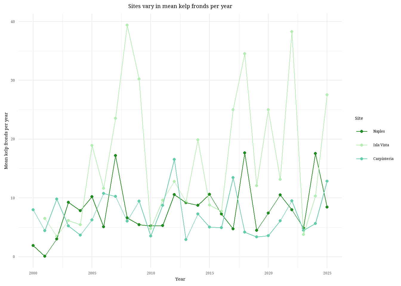
d. Interpretation
Isla Vista is the site with the most variable mean kelp fronds per year because you can see the line connecting the data points stretching all the way up to nearly 40 kelp fronds and then back down to below 10. Visually, you can see the data line for Isla Vista dance all over the graph, the data points are farther apart and less consistent than the other two sites. Carpinteria is the site with the least variable mean kelp fronds per year, visually identifiable because the data points are more consistent and the overall trend of the line does not exhibit massive swings in kelp fronds. The line remains just below or around 10 kelp fronds per year for nearly 25 years.
Problem 3. Data analysis
a. Response variable
The 1s and 0s represent whether the nest site was used (1) or available (0) by the Mountain plovers.
b. Purpose of study
Visual obstruction is a continuous variable, as implied from paragraph 2 in the data collection subsection of Nest-Site Selection where he researchers describe measuring visual obstruction at the nest using a Robel pole and also in the data table where it’s clear that vo_nest is a continuous variable. As visual obstruction increases, the probability of Mountain Plover nest site use would decrease because Mountain plovers prefer nest sites with short and sparse vegetation, as explained in paragraph 2 of the Introduction.
Distance to prairie dog colony edge is also a continuous variable. As distance to nearest prairie dog colony increases, the probability of Mountain Plover nest site use would decrease because Mountain plovers prefer disturbed soil with sparse vegetation to spot predators while also providing some cover. Information about the relationship between distance to colony and nest-site usage was found in the caption of the abstract figure while information about disturbance was found in paragraph 5 of the Introduction and in the Methods section, specifically paragraph 2 of the modeling framework subsection in Adult Mountain Plover Density.
c. Table of Models
4 models total:
| Model number | Visual obstruction | Distance to colony | Model description |
|---|---|---|---|
| 0 | no predictors (null model) | ||
| 1 | X | X | all predictors (saturated model) |
| 2 | X | just distance to prairie dog colony | |
| 3 | X | just visual obstruction |
d. Run the models
mopl_clean <- mopl |> #create new clean data frame
  clean_names() |> #clean column names
  select(edgedist, id, vo_nest) |> #select only three columns
  mutate(used_bin = case_match( #create binomial response variable
    id,
    "used" ~ 1,
    "available" ~ 0))

# model 0: null model
model0 <- glm(used_bin ~ 1, #run glm with no predictor variables
             data = mopl_clean, #data frame
             family = "binomial") #set binomial distribution

# model 1: all predictors
model1 <- glm(used_bin ~ edgedist + #run glm with both predictors
               vo_nest,
             data = mopl_clean, #data frame
             family = "binomial") #set binomial distribution

# model 2: edgedist only
model2 <- glm(used_bin ~ edgedist, #run glm with only one predictor
             data = mopl_clean, #data frame
             family = "binomial") #set binomial distribution

# model 3: vo_nest only
model3 <- glm(used_bin ~ vo_nest, #run glm with other predictor
             data = mopl_clean, #data frame
             family = "binomial") #set binomial distribution
e. Select the best model
AICc(model0, #run AICc for all models
    model1,
    model2,
    model3) |>
  arrange(AICc) #arrange lowest to highest
df AICc
model3 2 331.8130
model1 3 333.8293
model0 1 384.6318
model2 2 386.1351The best model as determined by Akaike’s Information Criterion (AIC) with a score of 331.81, is the model with only visual obstruction as the predictor variable and nest use as the response.
f. Check the diagnostics
plot( #create qqplot and DHARMa plots of residuals
  simulateResiduals(model3)) #use model 3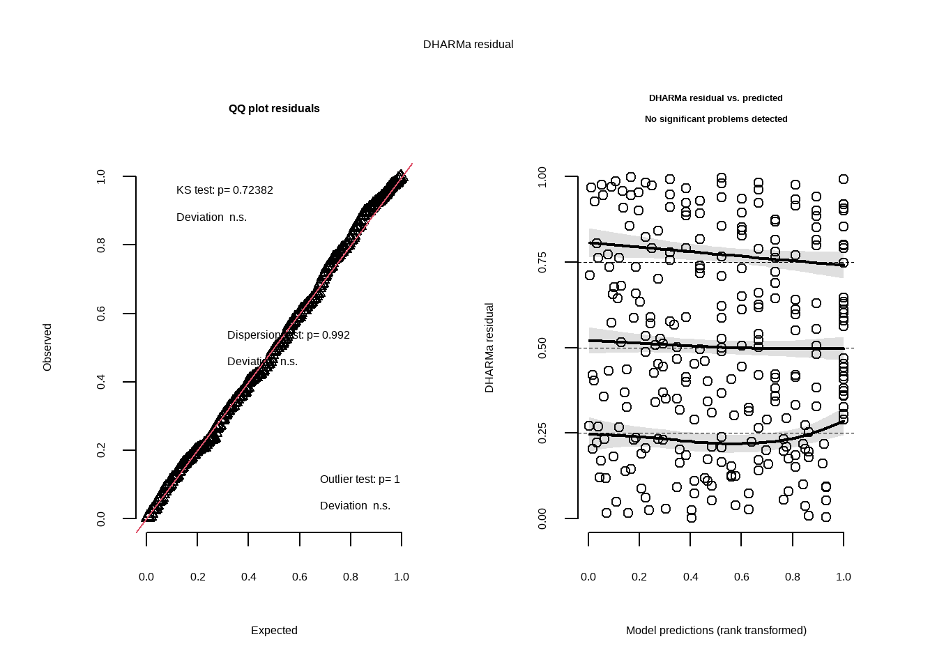
g. Visualize the model predictions
mod_preds <- ggpredict(model3, #create new object with predictions from model 3
                       terms = "vo_nest") #use vo_nest
ggplot(mopl_clean, #create base layer with mopl_clean data frame
       aes(x = vo_nest, #set x axis
           y = used_bin)) + #set y axis
  geom_point(size = 3, #add in data points and set size
             alpha = 0.4, #adjust transparency
             color = "cadetblue")+ #change color of data points
  geom_ribbon(data = mod_preds, #add in CI
              aes(x = x, #x axis
                  y = predicted, #y aixs
                  ymin = conf.low, #set lower range
                  ymax = conf.high), #upper range
              alpha = 0.4, #transparency
              fill = "cadetblue2") + #color of shaded area
  geom_line(data = mod_preds, #add in trendline
            aes(x = x, #x axis
                y = predicted), #y axis
            color = "navy") + #set line color
  scale_y_continuous(limits = c(0,1), #set y axis range
                     breaks =c(0,1)) + #y axis gridlines
  labs( x = "Visual Obstruction from Nest (dm)", #set x axis title
        y = "Nest Site Usage (1 = used, 0 = available)", #set y axis title
        title = "Nest site usage with visual obstruction") + #set plot title
  theme_minimal() |>  #change theme
  theme(panel.grid = element_blank(), #remove gridlines
        panel.background = element_blank()) #make background white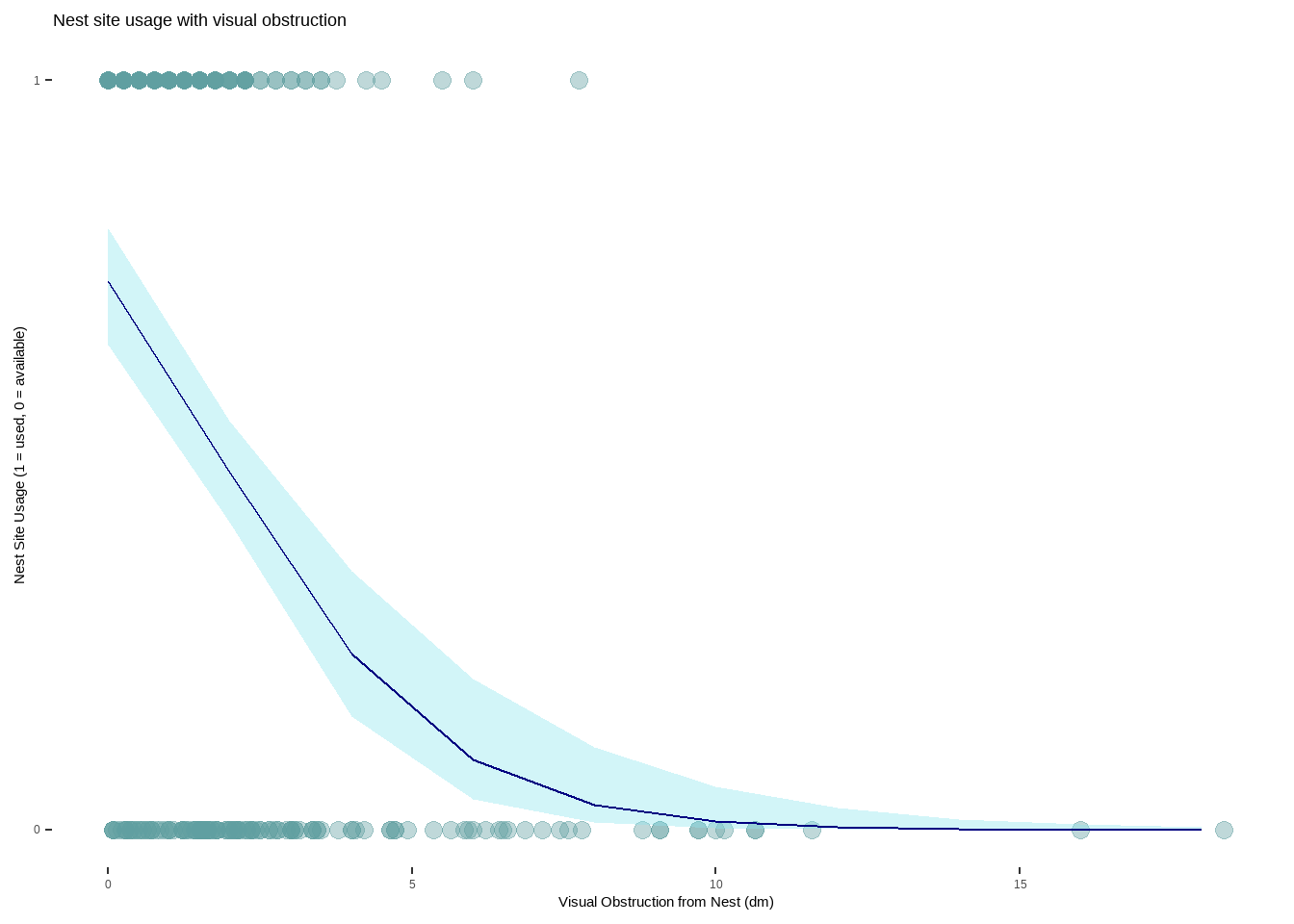
h. Write a caption for your figure
Figure 1. As visual obstruction at the nest site increases, the probability of nest site usage decreases. Each teal-colored point represents an individual nest that was assessed. The blue line represents the probability of a nest site being used as visual obstruction increases in distance (1 = 100%, 0 = 0%). The light blue shaded area around the line is a 95% confidence interval. Nest site usage is portrayed as a binomial variable with 1 being a used nest and 0 representing an available nest. Data from: Duchardt, Courtney; Beck, Jeffrey; Augustine, David (2020). Mountain Plover habitat selection and nest survival in relation to weather variability and spatial attributes of Black-tailed Prairie Dog disturbance [Dataset]. Dryad. https://doi.org/10.5061/dryad.ttdz08kt7
i. Calculate model predictions
ggpredict(model3, #use model3 for predictions
          terms = "vo_nest [0]") #prediction when vo_nest is 0
# Predicted probabilities of used_bin
vo_nest | Predicted | 95% CI
--------------------------------
0 | 0.73 | 0.65, 0.80j. Interpret your results
Mountain plovers tend to use nests when there is less visual obstruction at the nest site (Figure 1.) With every 1 dm increase in visual obstruction, the odds of a nest site being used decreases by a factor of 0.58 (95% CI: [0.47, 0.69], p < 0.001, \(\alpha\) = 0.05). If visual obstruction was 0 on the Robel index, the probability of a nest site being used is 0.73 (95% CI: [0.65, 0.80]), which makes sense biologically as there is some natural variability even with no obstruction. This is likely because Mountain plovers prefer habitats that have scarce vegetation and flat ground, allowing them to more easily detect predators while still providing some refugia. Distance to colony edge was not found to be a strong predictor of nest site usage, with models containing only visual obstruction as the predictor showing a stronger relationship to nest usage.
Problem 4. Affective and exploratory visualizations
a. Comparing visualizations
In Homework 2 I represented the relationship between reading genre and reading time using multiple bar graphs but in Homework 3 I used multiple box plots. Initially I thought that bar graphs would be the bets way to show how length of reading time changes with genre but as I collected more data I realized that the bin number and lack of specificity made it difficult to visualize the differences. To fix this I created box plots in Homework 3 that clearly show the median reading length for each genre, allowing easy comparison while also showing distribution.
In both Homework 2 and Homework 3 I created a scatter plot demonstrating the positive relationship between number of pages read and reading time. In terms of the bar graphs and the box plots, both visualizations show the distribution of data collected for each genre and display the range of data collected, albeit with some differences in specificity.
There appears to be no difference in median reading length between genres in both the bar graphs from Homework 2 and the boxplots in Homework 3. In the Homework 2 visualization there was such few data that no inferences could be made and it was difficult to interpret how reading time differed across genre. By Homework 3, all data had been collected (n=32) and you can see that all median bars across genres are about equal, with Nonfiction Novels having the largest spread.
I talked to An during week 9 about my visualization, specifically the bar plots, because I felt like it did not answer the question I had at the start, nor was it easy to compare across genres. I suggested, with approval, switching to box plots which I did because I felt it more accurately portrayed the data and made any differences easier to visually identify. I also received questions about the theme selection in my scatter plot from both An and my classmates but I decided to keep the gray theme because it makes the data between reading genre visually separate.
b. Designing an analysis
To determine if there is any difference in reading session length between reading genres, the best analysis would be a Kruskal-Wallis test because I have a continuous response variable (reading session length) and a categorical predictor variable with three factors (Nonfiction Novels, News, Research Papers) but at least one of the factors is not normally distributed.
reading_clean <- reading_data |> #create new clean data frame
  clean_names() |> #clean column names
  rename("reading_time" = "time_spent_reading_min", #rename columns to reading_time and genre
         "genre" = "reading_type")
reading_shapiro <- reading_clean |> #create new object for shapiro test
  group_by(genre) |>#group by genre
  summarize(p_value = shapiro.test(reading_time)$p.value) #run shapiro-wilks normality test on reading time by genre
print(reading_shapiro) #display results of shapiro-wilks test
# A tibble: 3 × 2
genre p_value
<chr> <dbl>
1 News 0.0584
2 Nonfiction Novels 0.000705
3 Research Paper 0.000190ggplot(data = reading_clean, #create base plot using clean data frame
aes(x = reading_time, #x axis is reading_time
fill = genre)) + #color bars by genre
geom_histogram(bins = 6) + #create histogram and set bin number
facet_wrap(~genre) #separate by genre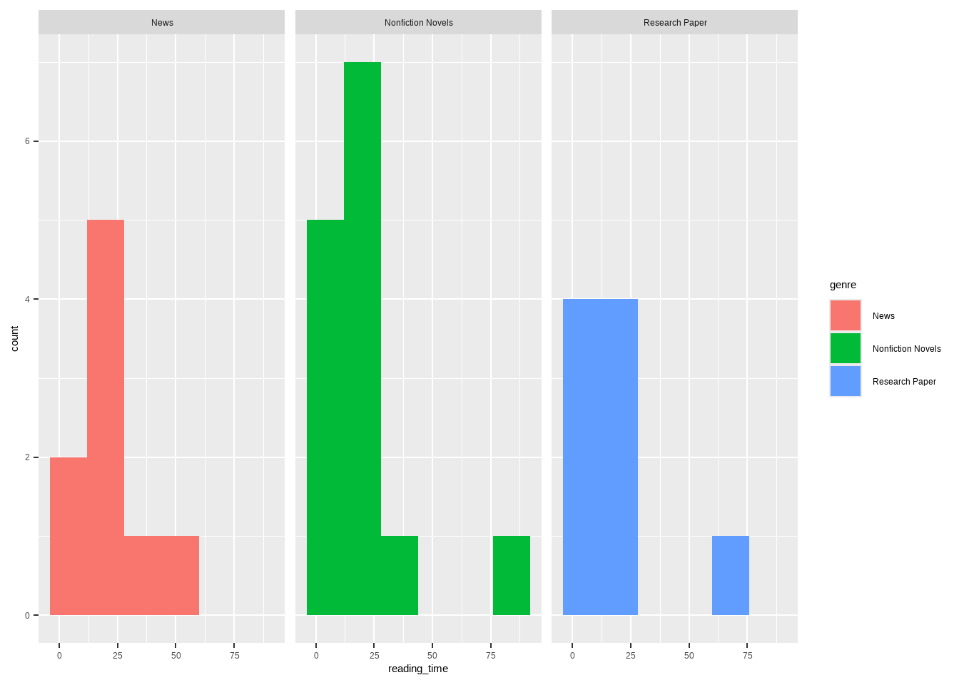
kruskal.test( #run kruskal-wallis test between reading time and genre
  reading_time ~ genre,
  data = reading_clean) #use clean data frame
    Kruskal-Wallis rank sum test

data:  reading_time by genre
Kruskal-Wallis chi-squared = 0.70291, df = 2, p-value = 0.7037dunn_test( #run post-hoc dunn test between reading time and genre
reading_time ~ genre,
data = reading_clean, #use clean data frame
p.adjust.method = "bonferroni") #name p-value adjustment method# A tibble: 3 × 9
.y. group1 group2 n1 n2 statistic p p.adj p.adj.signif
* <chr> <chr> <chr> <int> <int> <dbl> <dbl> <dbl> <chr>
1 reading_time News Nonfi… 9 14 -0.685 0.493 1 ns
2 reading_time News Resea… 9 9 -0.781 0.435 1 ns
3 reading_time Nonfiction… Resea… 14 9 -0.177 0.860 1 ns kruskal_effsize( #calculate kruskal-wallis effect size
reading_time ~ genre, #compare reading time across genres
data = reading_clean) #use clean data frame# A tibble: 1 × 5
.y. n effsize method magnitude
* <chr> <int> <dbl> <chr> <ord>
1 reading_time 32 -0.0447 eta2[H] small d. Create a visualization
ggplot(data = reading_clean, #create base layer with personal data
       aes(x = genre, #set x axis
           y = reading_time, #set y axis
           color = genre, #color by genre
           fill = genre)) + #fill by genre
  geom_boxplot(width = 0.6, #create box plot and set width
               alpha = 0.2, #set transparency of box plot
               outliers = FALSE) + #remove outliers
  geom_jitter(height = 0, #create jitter plot and restrict vertical jitter
              width = 0.2) + #set horizontal jitter
  labs(title = "Length of reading session per genre", #plot title
       x = "Genre", #x axis title
       y = "Reading session length (min)", #y axis title
       subtitle = "March 1, 2026") + #subtitle
  theme_minimal() + #set theme to minimal
  scale_color_manual(values = c( #change colors manually
    "Nonfiction Novels" = "darkgreen",
    "Research Paper" = "darkorchid",
    "News" = "coral2"))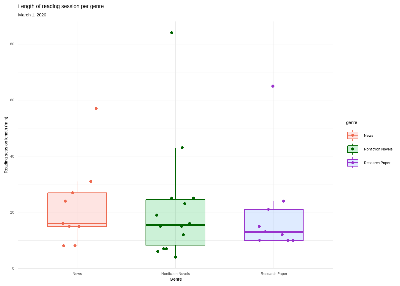
e. Write a caption
Figure 1. There is no difference in length of reading session across genre. Each genre contains a box plot displaying the median reading length, upper and lower quartiles, and minimum and maximum. Outliers are hidden for visual clarity but each genre’s highest point is classified as an outlier. Individual observations are layered on as data points. Genres are separated by color (pink: News, green: Nonfiction Novels, purple: Research Paper). All genres overlap with nearly identical medians. Data collected from January 6, 2026 to March 1, 2026 by Ian Del Tredici.
f. Write about your results
I found no significant difference in median reading session between Nonfiction Novels, News, and Research Papers (Kruskal-Wallis test, χ²(2) = 0.703, p = 0.704, α = 0.05). The effect size was negligible (\(\eta^2\) = -0.044) between the medians of the genres (Nonfiction Novels = 15.5min, News = 16min, Research Paper = 13min). This suggests that reading genre is not a strong predictor of reading session length and there may be other factors that contribute.